Warning: Undefined property: stdClass::$width in /home/klient.dhosting.pl/diablo/diablodesign.eu/public_html/plugins/system/helixultimate/src/Core/Classes/HelixultimateMenu.php on line 468
Warning: Undefined property: stdClass::$width in /home/klient.dhosting.pl/diablo/diablodesign.eu/public_html/plugins/system/helixultimate/src/Core/Classes/HelixultimateMenu.php on line 468
Warning: Undefined property: stdClass::$menualign in /home/klient.dhosting.pl/diablo/diablodesign.eu/public_html/plugins/system/helixultimate/src/Core/Classes/HelixultimateMenu.php on line 471
Warning: Undefined property: stdClass::$menualign in /home/klient.dhosting.pl/diablo/diablodesign.eu/public_html/plugins/system/helixultimate/src/Core/Classes/HelixultimateMenu.php on line 476
Warning: Undefined property: stdClass::$menualign in /home/klient.dhosting.pl/diablo/diablodesign.eu/public_html/plugins/system/helixultimate/src/Core/Classes/HelixultimateMenu.php on line 482
Warning: Undefined property: stdClass::$width in /home/klient.dhosting.pl/diablo/diablodesign.eu/public_html/plugins/system/helixultimate/src/Core/Classes/HelixultimateMenu.php on line 468
Warning: Undefined property: stdClass::$width in /home/klient.dhosting.pl/diablo/diablodesign.eu/public_html/plugins/system/helixultimate/src/Core/Classes/HelixultimateMenu.php on line 468
Warning: Undefined property: stdClass::$menualign in /home/klient.dhosting.pl/diablo/diablodesign.eu/public_html/plugins/system/helixultimate/src/Core/Classes/HelixultimateMenu.php on line 471
Warning: Undefined property: stdClass::$menualign in /home/klient.dhosting.pl/diablo/diablodesign.eu/public_html/plugins/system/helixultimate/src/Core/Classes/HelixultimateMenu.php on line 476
Warning: Undefined property: stdClass::$menualign in /home/klient.dhosting.pl/diablo/diablodesign.eu/public_html/plugins/system/helixultimate/src/Core/Classes/HelixultimateMenu.php on line 482
CSS Generator
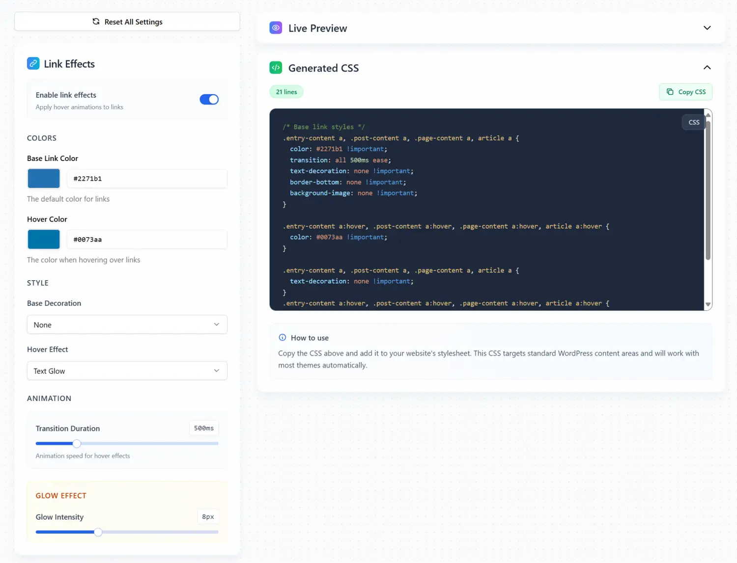
Hoverly – Create Elegant Hover Effects in Seconds
Hits: 5127
Hoverly is a lightweight tool that lets you add tasteful hover animations to links and headings without hand-coding. It focuses on clarity and speed: pick your colors, choose a decoration, set the transition time, and copy the generated CSS into your project.
Key Features
- Link Effects: Enable animations specifically for links to improve clarity and affordance.
- Headline Effects: Apply effects to selected heading levels (h1–h6) to guide attention across the page.
- Color Controls: Define a Base Link Color and a Hover Color for consistent theming.
- Decorations & Styles: Choose base decorations and hover effects (e.g., underline, border accents) for a polished look.
- Smooth Animation: Set a transition duration (default 300 ms) to keep motion subtle and refined.
- Live Preview: Test interactions instantly, including a Dark Mode toggle to verify contrast and readability.
- Generated CSS: One click produces clean CSS you can paste into your stylesheet.
How It Works
- Turn on Link Effects or Headline Effects depending on what you want to animate.
- Pick your Base and Hover colors.
- Choose a decoration and set a transition duration.
- Use the Interactive Preview (with Dark Mode if needed) to verify the look and feel.
- Copy the Generated CSS and add it to your project.
Why Use Hoverly?
- Focus and feedback: Hover states help users see what’s interactive and where to click.
- Consistency: Centralized settings ensure a unified style across your pages.
- Speed: Visual controls and instant preview shorten iteration time.
- Accessibility aware: Dark Mode preview and color controls help you maintain contrast and legibility.
Practical Tips
- Keep transitions between
150–300msfor a responsive feel without sluggishness. - Use hover effects to reinforce hierarchy: subtle for body links, slightly stronger for key calls to action.
- Verify color contrast in both light and dark themes to support readability.
Example CSS Snippet
/* Example: understated underline grow on hover */
a {
  color: var(--link-color);
  text-decoration: none;
  position: relative;
  transition: color 300ms ease;
}
a::after {
  content: "";
  position: absolute;
  left: 0; bottom: -2px;
  width: 0; height: 2px;
  background: var(--hover-color);
  transition: width 300ms ease;
}
a:hover {
  color: var(--hover-color);
}
a:hover::after {
  width: 100%;
}
Use Cases
- Marketing pages: Emphasize primary links and headings to improve scanability.
- Blogs and docs: Guide readers through long content with subtle headline cues.
- Portfolios: Add tasteful motion that complements, rather than distracts from, your work.
Conclusion
Hoverly streamlines the process of designing interactive states for links and headings. With live previews, dark-mode testing, and generated CSS, you can fine-tune motion and color quickly—keeping your interface elegant, consistent, and easy to use.